Inset buttons
Learn the basics of making buttons look like they are inset into your interfaces...
1
Here is something I use very often when making any sort of interface and its a handy trick to know. There are a few ways you can make buttons look like they are inset into the surface and here are the two I use most.
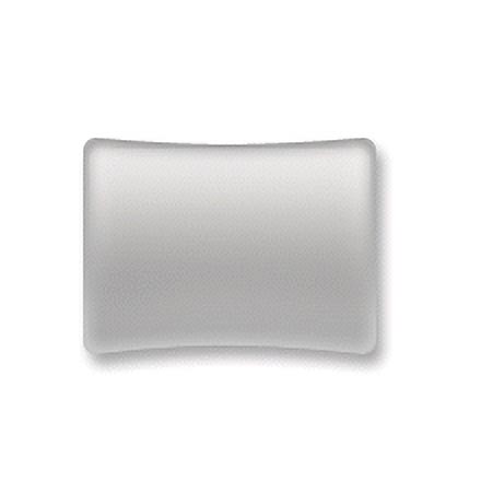
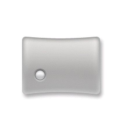
Firstly, you are going to need your interface that you want to add your buttons to. As you can see by the image opposite I am just going for a very simple interface to demonstrate. Most buttons on mobile phones and stereos of all types are inset, here is an example of what an inset is.
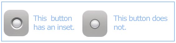
Looking at the above image the inset is what makes the button look like its meant to be there.
Its very simple to create actually so lets start.
Start with your interface shape (see the smooth metal tutorial on creating a panel similar to mine).
Firstly, you are going to need your interface that you want to add your buttons to. As you can see by the image opposite I am just going for a very simple interface to demonstrate. Most buttons on mobile phones and stereos of all types are inset, here is an example of what an inset is.
Looking at the above image the inset is what makes the button look like its meant to be there.
Its very simple to create actually so lets start.
Start with your interface shape (see the smooth metal tutorial on creating a panel similar to mine).
2
Ok firstly, create a new layer above the layer with your interface.
Set your foreground colour to: #C1C2C4.
Now select the Ellipse tool (note this is the shape tool not the marquee tool).
Ok now roughly where you want your button to appear, hold SHIFT and drag your circular shape to the size you want.
Ok now to give the button the chrome effect add the following layer styles.
Firstly add an Inner shadow with these settings:
Blend mode normal, colour white, opacity 29, angle -81, distance 2, choke 0, size 0.
Now add an Inner Glow:
Blend mode normal, opacity 22, noise: 0, colour: black, source: edge, choke: 0, size: 4.
Next up add a Gradient Overlay:
Blend mode screen, opacity 81, colour- gradient (black-white), style linear, angle 90, scale 49.
And last but not least add a Stroke:
Size: 1, position: outside, opacity: 34, colour: black.
When your done, you may want to save your layer style for later use.
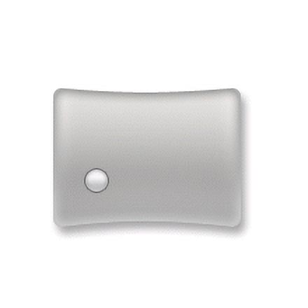
Click ok when your done. You should be left with a button similar to the one shown opposite.
Set your foreground colour to: #C1C2C4.
Now select the Ellipse tool (note this is the shape tool not the marquee tool).
Ok now roughly where you want your button to appear, hold SHIFT and drag your circular shape to the size you want.
Ok now to give the button the chrome effect add the following layer styles.
Firstly add an Inner shadow with these settings:
Blend mode normal, colour white, opacity 29, angle -81, distance 2, choke 0, size 0.
Now add an Inner Glow:
Blend mode normal, opacity 22, noise: 0, colour: black, source: edge, choke: 0, size: 4.
Next up add a Gradient Overlay:
Blend mode screen, opacity 81, colour- gradient (black-white), style linear, angle 90, scale 49.
And last but not least add a Stroke:
Size: 1, position: outside, opacity: 34, colour: black.
When your done, you may want to save your layer style for later use.
Click ok when your done. You should be left with a button similar to the one shown opposite.
3
So you now have you button sitting on top of your interface, but it doesn't look like its meant to be there. That's why we make it inset. So...
In your layers palette click on the vector mask of the button you just created:
This makes the path active.
Now switch to your paths palette.
Now drag the Path layer of your button to the image to duplicate it.
It will create a new path called Path 1.
Now use the Direct selection tool: and right click inside your document anywhere and choose "Free Transform Path".
Holding SHIFT and ALT together drag a corner to make the path slightly bigger than the button, when your done hit Enter.
4
The reason we are using paths here is they are much easier to resize without any loss of quality.
Next up...
Create a new layer UNDERNEATH the layer with your button on it.
Now with the Direct selection tool still active, right click anywhere in the document and choose "Create vector mask".
Now press X then D to reset your colours.
Hit CTRL + Backspace to fill the path in white.
Now go to Layer>Layer style>Gradient Overlay and enter these settings (or adjust them so it looks good).
Blend mode multiply, opacity 56, colour- gradient (white-black), angle 90, style linear, angle 90, scale 10.
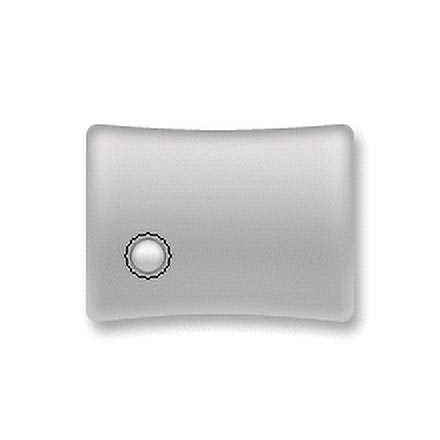
It should now look inset like mine opposite. See how it looks like it belongs there.
Next up...
Create a new layer UNDERNEATH the layer with your button on it.
Now with the Direct selection tool still active, right click anywhere in the document and choose "Create vector mask".
Now press X then D to reset your colours.
Hit CTRL + Backspace to fill the path in white.
Now go to Layer>Layer style>Gradient Overlay and enter these settings (or adjust them so it looks good).
Blend mode multiply, opacity 56, colour- gradient (white-black), angle 90, style linear, angle 90, scale 10.
It should now look inset like mine opposite. See how it looks like it belongs there.
5
Don't stop there, continue to try this effect on buttons of any shape, size or texture.
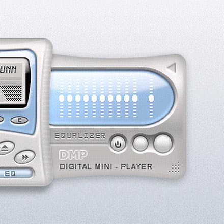
You can even make screens or LCD displays look like they are inset into the interface.
With a little effort, you can produce some almost photo-realistic stuff.
Have fun with this tutorial and learn from it. If you make a lot of interfaces you'll find that you use this a lot not just for the buttons but for just about anything.
Enjoy
This tutorial was brought to you by Robouk, please post any questions in the forum. Thank you.