Floodcard wallpaper
A walkthrough on how to create that popular wallpaper from floodgear...

There is really no way you can directly copy this kind of work - there are two main points:
The file must be a very high resolution - Given a choice I would go for anything from 400 to 600dpi for this type of image at A3. This retains all the complexity of the elements you want to introduce. Always err on the safe side when it comes to resolution (within reason)- you never know how your design will be used!
Just do what looks good to you - There is actually no point in trying to reproduce the same effect each time. Each time you do it its different! Hopefully the techniques I`ve described will be useful, but remember the whole point is to find your own style!. The best way to work is just to brainstorm in Photoshop - working quickly as you can lifting in elements and shifting things around - until something happens.
1
I'm not going to describe each step in detail because there's just too many! What I've given is a kind of shortened version with the main steps outlined for you:
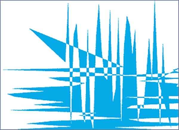
First in Illustrator make a square and use Illustrators roughen filter - to create a random jagged vector shape - and copy and paste the shape (as a path) into a new file with a white background, see above for resolution. If you don't have Illustrator then you can make up a similar shape with the pen tool - just a sharp cornered shape - duplicate it as many times as you want and free transform the shape until you get something you like. Don't worry at this stage whether its the same as mine -its all going to change anyway!
First in Illustrator make a square and use Illustrators roughen filter - to create a random jagged vector shape - and copy and paste the shape (as a path) into a new file with a white background, see above for resolution. If you don't have Illustrator then you can make up a similar shape with the pen tool - just a sharp cornered shape - duplicate it as many times as you want and free transform the shape until you get something you like. Don't worry at this stage whether its the same as mine -its all going to change anyway!
2
Now make a new layer, control click the path and fill the selection with a blue colour. Turn on preserve transparency and use the line tool (set to "create filled region") to fill in some random lines - all we are doing here is creating a complex base layer.
In my example I have also free transformed and distorted the shape at this point just scaling and rotating slightly.
Duplicate this layer two or three times -
Darken the first (brightness/contrast) and move it underneath - turn off preserve transparency and blur it - this gives a kind of drop shadow. With the other duplicates free transform them, shrinking or enlarging and hue shifting slightly.
Its looks a total mess right? - GOOD- that's what we want!
3
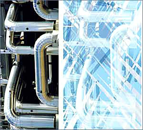
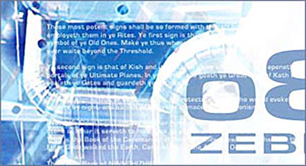
Now introduce some photographic element I used this shot of pipes... don't know why - I just like pipes! Something industrial with strong lines and geometry will do. On the left is the original shot and on the right it's placed in the file - Use screen mode and increase the contrast.
4
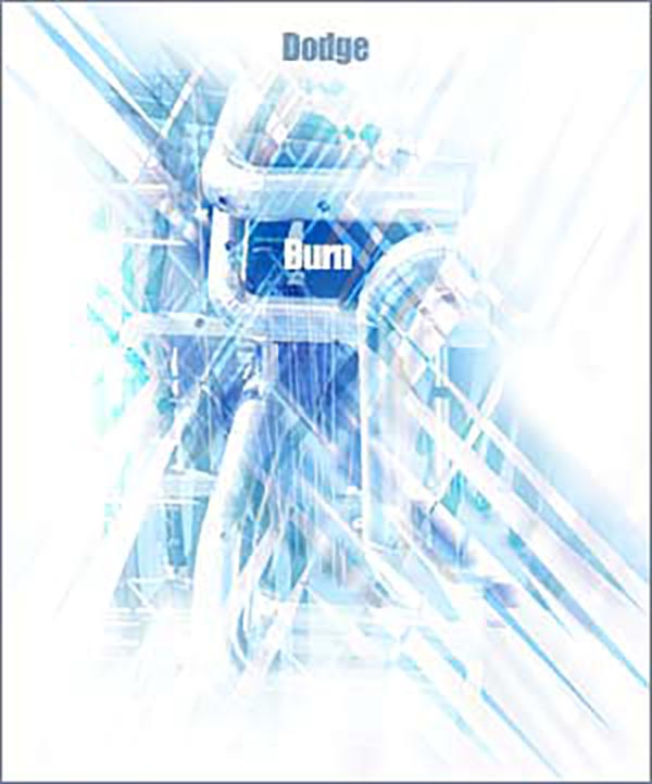
This is the bit where it should all start coming together! Add a new layer set to Overlay mode. Reset colours - press D. Now using a big soft airbrush at 10% opacity dodge out and burn in the areas you want- use black and white (mainly white - switch using the X key). I filled my layer before with 50% grey but you don't need to do this.
This is a great method for adding emphasis and highlights to a design.
This is a great method for adding emphasis and highlights to a design.
5
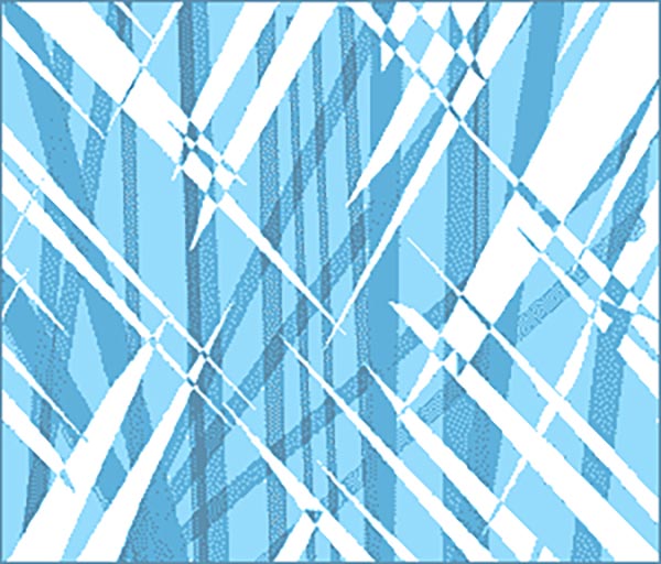
There is a shaft of light, which extends from the text - create this with a new Screen layer make a rectangular selection, fill with white, guassian blur and then transform this to the place you want.
There is also some white text added to a layer which adds some more geometry, and design to the image. Lower the opacities of both these layers.
There is also some white text added to a layer which adds some more geometry, and design to the image. Lower the opacities of both these layers.
6
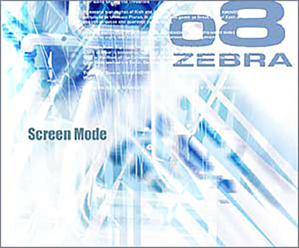
Up to this point what you have is really just a kind of abstract composition. The logo and type is obviously what brings it all together. I used a sans serif font, gave it a stroke, to make it even bolder. and squashed it with the scale tool. Find your own solutions here!
I felt the composition needed "anchoring" because it was just kind of floating around in white space so on the top, I created a layer set with nested shape layers with vertical lines at varying opacities. I then added a layer mask to the set, to mask out the areas I didn't want, and when I was happy merged the set.
I felt the composition needed "anchoring" because it was just kind of floating around in white space so on the top, I created a layer set with nested shape layers with vertical lines at varying opacities. I then added a layer mask to the set, to mask out the areas I didn't want, and when I was happy merged the set.
OK that's it!
One technique which I haven't used here that is also sometimes useful with this type of image, is to use a hue/saturation adjustment layer (set to colourize). This can help you unify the elements.
Give it a try and good luck!
One technique which I haven't used here that is also sometimes useful with this type of image, is to use a hue/saturation adjustment layer (set to colourize). This can help you unify the elements.
Give it a try and good luck!
This tutorial was by [email protected], brought to you by Robouk, please post any questions in the forum. Thank you.